Overview
The goal of this document is to provide comprehensive reference documentation for developers, analysts or QA who want to write User Interface tests with Tyro. It also explains how to write good UI tests scenarios.
Introduction
Tyro is a web user interface testing tool to test any web application.
What makes it stand out from the crowd is its beautiful and highly expressive language.
Tyro provides, on one hand, an abstraction of the UI business domain through an expressive API and, on the other hand, a way to express this domain via a DSL (a button semantically stays a button, whatever the technology).
With Tyro, you can therefore write tests with a seldom achieved level of expressiveness and make those tests INDEPENDENT of the underlying technology.
Tyro is built on top of the WebDriver browser automation library, which means that Tyro can work with any browser that WebDriver supports.
Why Tyro is unique
Tyro is the result of numerous real-world observations of developers in the trenches in the area of GUI testing.
Working for many years to promote the TDD/BDD approaches, we often faced difficulties in their implementation for the graphical layer of applications.
The "TEST FIRST" principle excludes all scenario recorder based approaches that only allow you to write tests as a second thought. Our experience has taught us that this path is a dead-end.
Another problem is UI tests are brittle and costly! We do think that this is due to the lack of abstraction in existing UI testing tools.
Therefore, Tyro can transform tests in real assets, present throughout the lifecycle of the application and always in tune with the latest version of the application.
Tyro is an opinionated tool. It forces the user to see and use the domain layer as a composition and aggregation of UI components (in Tyro, everything is a UI component).
Getting started
Quick start from a template
Tyro comes with a bunch of starters for different combinations of testing tools (JUnit4, JUni5, Cucumber…).
These starters give you a good taste of the power and flexibility of Tyro.
First examples
Let’s have a look at some simple examples of Tyro use.
A simple specification test
A simple form like this :
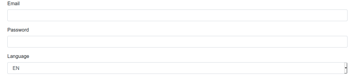
can be specified like this :
1
2
3
4
5
6
7
8
9
10
11
12
13
14
15
16
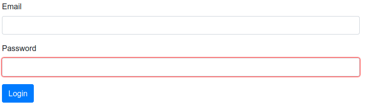
field('Email').should {
be visible
be empty
}
field('Password').should {
be visible
be empty
}
dropdown('Language').should {
be visible
have 2.items
have items('EN', 'FR')
have selectedItem('EN')
}
A simple functional test
The check/uncheck behavior of the following choice :
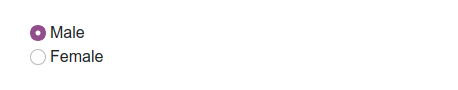
can be tested like this :
  1
2
3
4
5
6
7

  radio("Male").should { be checked }
radio("Female").should { be unchecked }

check radio("Female")

radio("Male").should { be unchecked }
radio("Female").should { be checked }
Functional vs Specification tests
In the UI test area you need to face with two type of tests: Functional tests and Specification tests.
The Functional tests
This type of tests describes the user intention.
For example:
-
As a user I want to log in my application
-
As a user I want to send a message
These tests focus on the interaction between the user and the UI.
In the case of a login scenario you want to describe something like :
-
User fills his username.
-
User fills his password.
-
User clicks on login button.
Generally it’s black box testing. You have a state before the action and a state after. The well-known pattern used is the famous Gherkin language Given-When-Then
The Specification tests
This type of test describes the design language between the user and the application.
For example:
-
A field should be visible
-
A field should be disabled by default
-
A field should have expected label
-
…
This type of tests are very useful to check the expected state of the screen.
Finding components
One of the most important Tyro’s features is its flexibility and power to find UI components. As we discussed earlier, Tyro is based on an abstraction of the UI. So to give you the best experience Tyro has many ways to find components. It’s yours to use what suits your case.
The $ function
The $ function is the access point for fetching components on the page. The $ function accepts a selector to target your component.
The expression is pretty simple and always follows the same pattern:
Abstraction component = $('*the selector*') as Implementation|
Tyro is typed. The $ selector is to find/locate the component, the as is to verify that the component is the expected type. |
Tyro is based on an abstraction but comes with a default implementation: the Web implementation based on Selenium.
This base implementation accepts the powerful JQuery selectors to find components in your page.
Our experience demonstrated that we never need complex selector. Especially if you write tests first, a simple finding expression will push you to write clean html components (example : only one button with a given label in the same page).
In the code, this is reflected by a custom tag, the sequence in the page, a role attribute, or an id. In all these cases, a css3 selector is more than enough.
|
The $ function NEEDS to target a UNIQUE component. If Tyro finds several components for the selector, it simply fails! For multiple selection use $$ function. |
Examples
A TextField by id.
    TextField textfield = $('[id="myId"]') as InputTypeText
    TextField textfield = $('#myId') as InputTypeText // Shortcut
TextField is the abstraction and InputTypeText is the implementation for the targeted technology (in this case Html5)
|
the shortcut # cannot be used for ids with '.' inside (not supported by JQuery) |
A TextField by class.
    TextField textfield = $('[class="myClass"]') as InputTypeText
    TextField textfield = $('.myClass') as InputTypeText // Shortcut
A TextField by name.
TextField textfield = $('[name="myName"]') as InputTypeTextA TextField by data-role.
TextField textfield = $('[data-role="myRole"]') as InputTypeTextThe second TextField in the page corresponding to an input html tag with type = 'text'.
TextField last_name = $('input:eq(1)') as InputTypeTextThe first Heading element in the page corresponding to an h3 html tag.
Heading sectionSubTitle = $('h3:eq(0)') as H3The third Button in the page with 'myName' name.
Button go_button = $('[name="myName"]:eq(2)') as sc.tyro.bundle.html5.ButtonThe first DataGrid in the form with 'myName' name.
DataGrid getOperationTable = $('form[name="myName"] > table:eq(0)') as Table|
The selected component MUST BE TYPED through the "as" keyword. |
The $$ function
The $$ function follows the sames rules of $ function except it returns a list of components.
|
These components need to be of the same type. |
Examples
A List of Items.
  <html>
    <select>
      <option>New-York</option>
      <option>Montpellier</option>
      <option>Chicago</option>
    </select>
</html> List<Item> items = $$('select option', Option)In this example we take the list of Html5 Option components under the Html5 Select component (the 3 towns) and we return them as a list of Items.
Using factories
Tyro comes with a bunch of components factories. Factories should be used as the first way to find components. In TDD approach this will drive your page design with the best semantic and structure.
Find Button using its text.
Button button = button('Submit')Find Radio using its label or placeholder.
Radio radio = radio('label')Find CheckBox using its label or placeholder.
CheckBox checkbox = checkbox('label')Find Dropdown using its label or placeholder.
Dropdown dropdown = dropdown('label')Find Field using its label or placeholder.
    Field field = field('label')
    TextField field = field('label', TextField)
Find ListBox using its label or placeholder.
ListBox listBox = listBox('label')Find Group using its value.
Group group = group('value')Find Item using its value.
Item item = item('value')Find Heading using its text.
Heading heading = heading('text')Find Panel using its title.
Panel panel = panel('title')Find Link using its text.
Link link = link('text')Find Component using its text.
Component myComponent = findByText('text', Component)Find Component using its label.
Component myComponent = findByLabel('label', Component)Find Component using its value.
Component myComponent = findByValue('value', Component)Find Component using its title.
Component myComponent = findByTitle('value', Component)|
Sometimes the UI can contain more than one item with the same test/value/label … Example: Two button with text 'Ok' In this case you can scope your search by passing the parent context to the factory method. Find Component using its title scoped in parent context |
Interacting with components
In Tyro, interacting with components is very easy and powerful.
|
The following actions are shared by all Tyro components :
click, rightClick, doubleClick, mouseOver, drag |
With Mouse
clickOn component
doubleClickOn component
rightClickOn component
drag panel on dropZone
With Keyboard
Field emailField = field('Email', EmailField)

emailField.should { have value("") }
clickOn emailField // To get the focus
type SHIFT + 'tyro'
emailField.should { have value('TYRO') }
With Actions
Tyro offers an advanced interaction feature. It allows a functional way to interact with components. It’s a good way to minimize common side effects on UI tests.
check
This action does some assertions and verifies that the component is visible, not deactivated and not already in the expected state. So for example, if you try to check a component already checked, an exception is thrown.
This action applies on Checkable components.
|
Syntax is : check <component> |
CheckBox checkBox = checkbox('Checkbox Label')
checkBox.should { be unchecked }

check checkBox

checkBox.should { be checked }
uncheck
This action does some assertions and verifies that the component is visible, not deactivated and not already in the expected state. So for example, if you try to uncheck a component already unchecked, an exception is thrown.
This action applies on UnCheckable components.
|
Syntax is : uncheck <component> |
checkBox.should { be checked }

uncheck checkBox

checkBox.should { be unchecked }
fill
With this action you can fill a field directly without passing by the keyboard. This must be the preferred way to set value on a field in a form, because most of the time the validation is needed when you leave the field. In the case you want a validation when entering characters in the field, you must use the keyboard action "type".
This action applies on Field Components.
|
Syntax is : fill <field> with <value> |
EmailField emailField = field('Email')

emailField.should { be empty }

fill emailField with 'joe.black@email.org'

emailField.should {
    be filled
    have value('joe.black@email.org')
}
clear
This action is used to clear a field. Here again it’s done directly without passing by the keyboard (just changing the value of the field).
This action applies on Field Components.
|
Syntax is : clear <field> |
emailField.should {
    be filled
    have value('joe.black@email.org')
}

clear emailField

emailField.should { be empty }
set
This is the same action as fill. It’s just a better word for suite components like Range, DatePicker, ColorPicker…
This action applies to some Field Components.
|
Syntax is : set <field> to <value> |
RangeField range = field('Range', InputTypeRange)

range.should { have value(10) }

set range to 20

range.should { have value(20) }
submit
This action is used to submit a form. It tries to find the expected submit button attached to the form and clicks on it if it’s available or fails if it’s not.
This action applies on Submissible Components.
|
Syntax is : submit <component> |
submit myFormreset
This action is used to reset a form. It tries to find the expected reset button attached to the form and clicks on it if it’s available or fails if it’s not.
This action applies on Resettable Components.
|
Syntax is : reset <component> |
reset myFormswitchOn
This is the same action as check. It’s just a better word to suite components like Switch …
This action applies on Switchable components.
|
Syntax is : switchOn <component> |
switchOn darkThemeswitchOff
This is the same action as uncheck. It’s just a better word to suite components like Switch …
This action applies on UnSwitchable components.
|
Syntax is : switchOff <component> |
switchOff darkThemeselect
This action does some assertions and verifies that the item is visible, not deactivated and not already selected. So for example if you try to select an item already selected an exception is thrown.
This action applies on Item.
|
Syntax is : select <item> |
select myItem_1, myItem_2unselect
This action does some assertions and verifies that the item is visible, not deactivated and not already unselected. So for example if you try to unselect an item already unselected an exception is thrown.
This action applies on Item.
|
Syntax is : unselect <item> |
unselect myItem_1, myItem_2on
This action is just a pass through (a function who returns the passed component). It’s here to improve readability of a test.
|
Syntax is : on <component> select <item> or on <component> unselect <item> |
Dropdown language = dropdown('Language')
language.should { have selectedItem('EN') }

on language select 'FR'

language.should { have selectedItem('FR') }
Domain Components
Tyro provides a set of UI Domain Objects. With them, you have the most useful components to write a UI test.
|
The following states are shared by all Tyro components :
enabled, disabled, available, missing, hidden, visible, contains, displays |
Button
a button refers to any graphical control element that provides the user a simple way to trigger an event, like searching for a query at a search engine, or to interact with dialog boxes, like confirming an action.
| States | Properties | Actions |
|---|---|---|
text |
Usage:
button.should { have text('Submit') }CheckBox
a checkBox is a small box that, when selected by the user, shows that a particular feature has been enabled or a particular option chosen. Check boxes are commonly used when more than one option may need to be selected.
| States | Properties | Actions |
|---|---|---|
checked |
label |
|
unchecked |
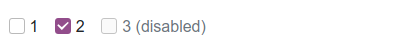
Usage:
checkbox_1.should {
    have label('1')
    be enabled
    be unchecked
}

checkbox_2.should {
    have label('2')
    be enabled
    be checked
}

checkbox_3.should {
    have label('3 (disabled)')
    be disabled
    be unchecked
}
Radio
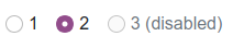
a radio button allows the user to choose only one of a predefined set of options. Radio buttons are arranged in groups of two or more and displayed on screen as, for example, a list of circular holes that can contain white space (for unselected) or a dot (for selected). Each radio button is normally accompanied by a label describing the choice that the radio button represents. The choices are mutually exclusive; when the user selects a radio button, any previously selected radio button in the same group becomes deselected (making it so only one can be selected).
| States | Properties | Actions |
|---|---|---|
checked |
label |
|
unchecked |
Usage:
radio_1.should {
    have label('1')
    be enabled
    be unchecked
}

radio_2.should {
    have label('2')
    be enabled
    be checked
}

radio_3.should {
    have label('3 (disabled)')
    be disabled
    be unchecked
}
Dropdown
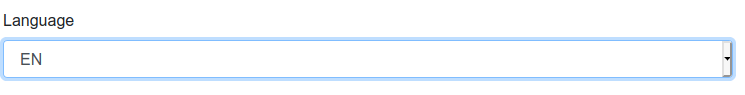
a dropdown allows the user to choose one value from a list. When a dropdown is inactive, it displays a single value. When activated, it displays (drops down) a list of values, that can be eventually grouped by a theme, from which the user may select one. When the user selects a new value, the control reverts to its inactive state, displaying the selected value.
| States | Properties | Actions |
|---|---|---|
label |
||
items |
||
groups |
Usage:
dropdown.should {
be visible
have label('Language')
have 2.items
have items('EN', 'FR')
have selectedItem('EN')
0.groups
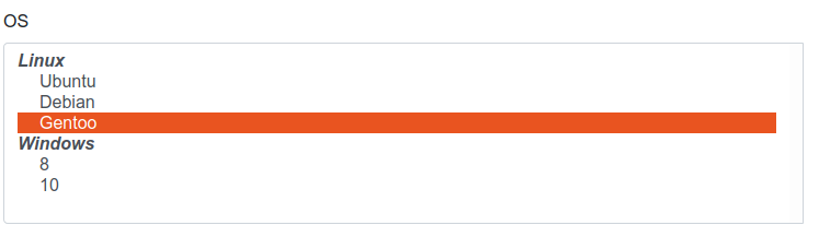
}Group
Group is used for groups of items in dropDowns.
| States | Properties | Actions |
|---|---|---|
value |
||
items |
Usage:
os.should {
    have label('OS')
    have 5.items
    have 2.groups
}

os.group('Linux').should {
    have 3.items
    have items('Ubuntu', 'Debian', 'Gentoo')
}

os.group('Windows').should {
    have 2.items
    have items('8', '10')
}
ListBox
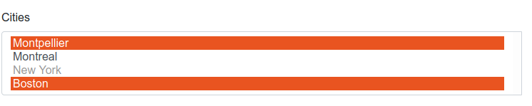
a listBox allows the user to select one or more items from a list contained within a static, multiple line text box. The user clicks inside the box on an item to select it, sometimes in combination with the ⇧ Shift or Ctrl in order to make multiple selections. "Control-clicking" an item that has already been selected, unselects it.
| States | Properties | Actions |
|---|---|---|
label |
||
items |
||
selectedItems |
||
visibleItems |
Usage:
cities.should {
    have label('Cities')
    have 4.items
    have 4.visibleItems
    have items('Montpellier', 'Montreal', 'New York', 'Boston')
    have selectedItems('Montpellier', 'Boston')
}

cities.item('New York').should { be disabled }
ListView
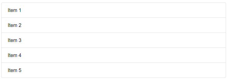
Definition: a listView allows the user to display items in a list format (with bullet points or numbers, indentation,…).
| States | Properties | Actions |
|---|---|---|
items |
Usage:
list.should {
    have 5.items
}
Item
Item is used for the elements listed in Dropdown, ListBox and ListView
Item in ListBox or Dropdown
| States | Properties | Actions |
|---|---|---|
selected |
value |
|
unselected |
Usage:
cities.items()[0].should {
    have value('Montpellier')
    be selected
}

cities.item('New York').should {
    be disabled
    be unselected
}
Item in ListView
| States | Properties | Actions |
|---|---|---|
value |
Usage:
list.items()[0].should { have value('Item 1') }
list.item('Item 2').should { be visible }
Link
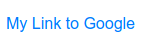
Definition: a link allows the user to navigate from page to page.
| States | Properties | Actions |
|---|---|---|
text |
||
reference |
Usage:
link.should {
    have text('My Link to Google')
    have reference('https://www.google.com/')
}
Form
Definition: a form allows the user to collect user input. Form elements are filled with different types of input elements, checkboxes, radio buttons, submit buttons, and more.
| States | Properties | Actions |
|---|---|---|
valid |
||
invalid |
Usage:
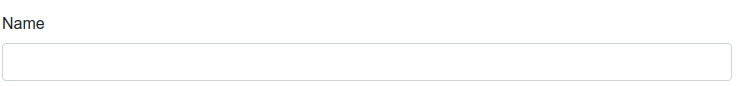
form.should { be invalid }Field
This is the base component for all types of fields.
| States | Properties | Actions |
|---|---|---|
empty |
text |
|
filled |
label |
|
readOnly |
placeholder |
|
required |
value |
|
optional |
||
valid |
||
invalid |
|
All following types of fields inherit these states, properties and actions. |
TextField and all its variations (EmailField, PasswordField, URLField, SearchField)
a textfield allows the user to enter text information to be used by the program. It can be a single-line text box when only one line of input is required, and a multi-lines text box if more than one line of input may be required.
| States | Properties | Actions |
|---|---|---|
length |
Usage:
textField.should { have length(74) }RangeField and its variations (DateField, NumberField)
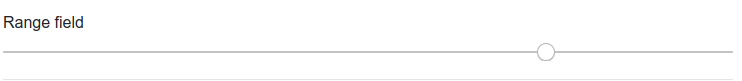
Definition: a rangeField is used for fields that must contain a value within a range.
| States | Properties | Actions |
|---|---|---|
inRange |
maximum |
|
outOfRange |
minimum |
|
step |
Usage:
rangeField.should {
    have minimum(0)
    have maximum(100)
    have value(76)
    have step(2)
    be inRange
}
Other fields (ColorField, DateTimeField, MonthField, WeekField, TimeField, PhoneField)
No specific states, properties or actions for these.
Panel
a panel is a particular arrangement of information grouped together for presentation to the user.
| States | Properties | Actions |
|---|---|---|
title |
Image

Definition: an image allows the user to insert an image (gif, jpg, png,…) from a source file
| States | Properties | Actions |
|---|---|---|
reference |
Usage:
image.should { have reference(BASE_URL + '/img/seahorse.jpg')}Heading
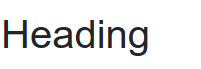
Definition: a heading allows the user to put a title for a page or a paragraph.
| States | Properties | Actions |
|---|---|---|
text |
Usage:
heading.should { have text('Heading')}Paragraph
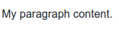
Definition: A paragraph is a self-contained unit of discourse in writing dealing with a particular point or idea. — inspired from Wikipedia definition
| States | Properties | Actions |
|---|---|---|
text |
Usage:
paragraph.should { have text('My paragraph content.')}Datagrid
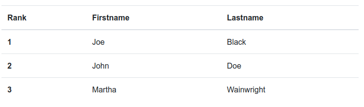
Definition: a datagrid is a component that allows user to present data in a tabular view, with cells organized in rows and columns.
| States | Properties | Actions |
|---|---|---|
rows |
||
columns |
Usage:
dataGrid.should {
    have 3.columns
    have 3.rows
}
Column
Definition: a column is the vertical element of a datagrid ; it is composed of cells and can have a title.
| States | Properties | Actions |
|---|---|---|
cells |
||
title |
Usage:
dataGrid.columns()[1].should {
    have title('Firstname')
    have 3.cells
}
Row
Definition: a row is the horizontal element of a datagrid ; it is composed of cells and can have a title.
| States | Properties | Actions |
|---|---|---|
cells |
||
title |
Usage:
dataGrid.rows()[1].should {
    have title('2')
    have 2.cells
}
Cell
Definition: a cell is the finest element of a datagrid.
| States | Properties | Actions |
|---|---|---|
value |
Usage:
dataGrid.rows()[0].cells()[1].should {
    have value('Black')
}
Html5 - Tyro equivalence
| Reminder : States shared by all Tyro components |
|---|
enabled, available, visible, contains |
Html5 - Tyro equivalence
|
for input html5 tags : see next section |
| HTML tag | Tyro core component | State | Properties | Actions | Tyro HTML class |
|---|---|---|---|---|---|
button |
text |
Button |
|||
select |
label, number of items, items, number of groups, groups, selectedItem |
Select |
|||
select (multiple) |
label, number of items, items, selectedItem, number of visible items |
MultiSelect |
|||
textarea |
empty, filled, readOnly, required, optional, valid, invalid |
text, label, placeholder, value, length |
TextArea |
||
optgroup |
value, items |
OptionGroup |
|||
option |
selected, unselected |
value |
Option |
||
form |
valid, invalid |
Form |
|||
h1, h2, h3, h4, h5, h6 |
text |
H1, H2,H3, H4, H5, H6 |
|||
img |
reference |
Img |
|||
a |
text, reference |
A |
|||
ul |
items, number of items |
Ul |
|||
ol |
items, number of items |
Ol |
|||
li |
value |
Li |
|||
div |
title |
Div |
|||
table |
rows, columns |
Table |
|||
th |
cells, title |
Th |
|||
tr |
cells, title |
Tr |
|||
td |
value |
Td |
|||
article |
Component |
paragraphs |
Article |
||
aside |
Component |
Aside |
|||
header |
Component |
Header |
|||
footer |
Component |
Footer |
|||
label |
Component |
text |
Label |
||
p |
text |
P |
|||
section |
Component |
paragraphs, articles |
Section |
||
span |
Component |
text |
Span |
Html5 input tags
| HTML tag | Tyro core component | State | Properties | Actions | Tyro HTML class |
|---|---|---|---|---|---|
checkbox |
checked, unchecked |
label |
InputTypeCheckBox |
||
radio |
checked, unchecked |
label |
InputTypeRadio |
||
Shared by all Tyro Field components |
|||||
All below components inherit from Field |
empty, filled, readOnly, required, optional, valid, invalid |
text,label, placeholder, value |
|||
text |
TextField |
length |
InputTypeText |
||
color |
ColorField |
InputTypeColor |
|||
datetime-local |
DateTimeField |
InputTypeDateTime |
|||
date |
DateField |
inRange, outofRange |
maximum, minimum, step |
InputTypeDate |
|
time |
TimeField |
InputTypeTime |
|||
month |
MonthField |
InputTypeMonth |
|||
week |
WeekField |
InputTypeWeek |
|||
EmailField |
length |
InputTypeEmail |
|||
password |
PasswordField |
length |
InputTypePassword |
||
number |
NumberField |
inRange, outofRange |
maximum, minimum, step |
InputTypeNumber |
|
range |
RangeField |
inRange, outofRange |
maximum, minimum, step |
InputTypeRange |
|
tel |
PhoneField |
InputTypeTel |
|||
search |
SearchField |
length |
InputTypeSearch |
||
url |
URLField |
length |
InputTypeURL |
||